site redesign
21/03/24
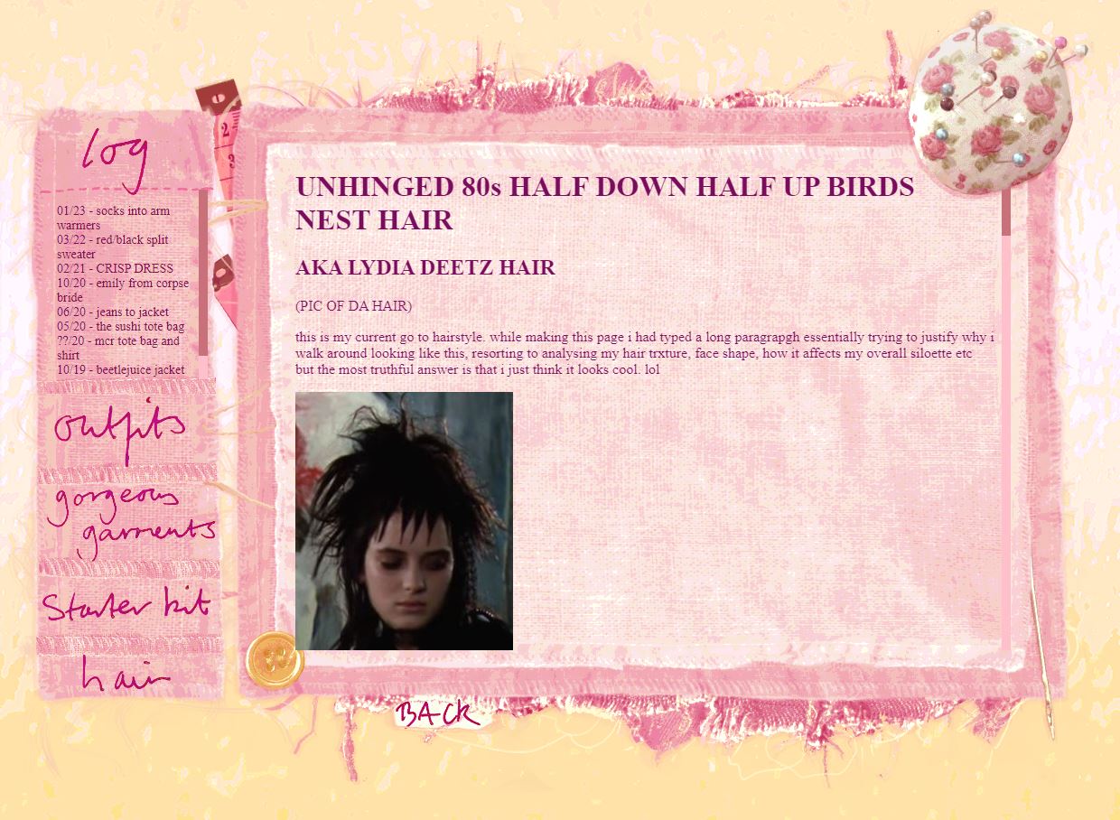
hello friendsas you can see, i decided to have a bit more fun with my website design :o)
my site has always been very bare bones shitty as fuck basic html and more or less no skill has been developed out of the month or so i first took to learn html and css...but at the end of the day, the site has done what i needed it to so i didnt exactly mind. its more important for me to focus the things i am actually making or writing that may or may not end up on the site. i think having a beautiful layout is a bonus. but i do i see so many wonderful site layouts all across the internet that make me feel so inspired, and ive been itching to try something different in these winter months so i decided this year i wanted to try my hand at making the layouts on this site more interesting.
it was important to still keep things relatively simple but also feel lively and fun to look at. i really like collage styles and subtle nods to the real world in digital spaces. every image used to make these layouts are photos of things i own, things ive photographed at some other point, or things ive painted/handwritten myself. so to me i can look at each layout and it makes a bridge between my real life and the online in a whimsy kind of way. theyve been very enjoyable to make and a different way to be creative for me:)
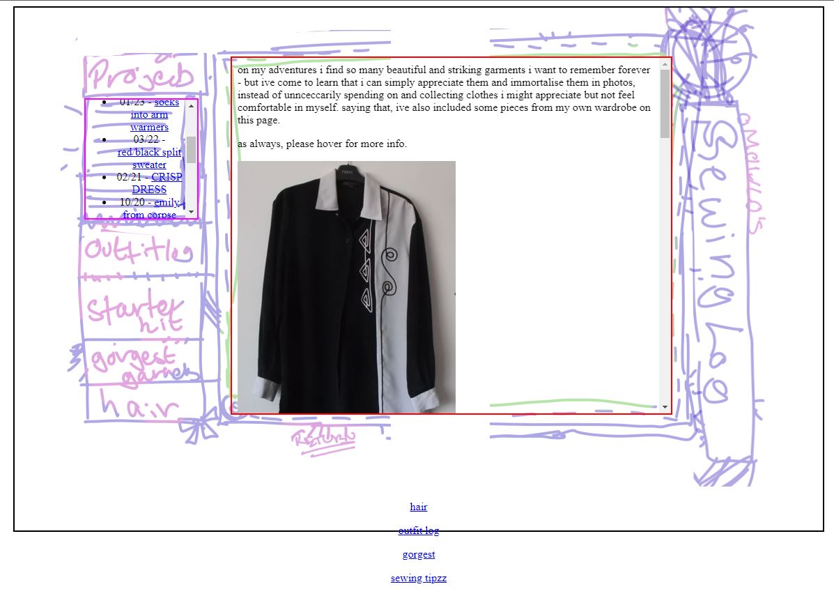
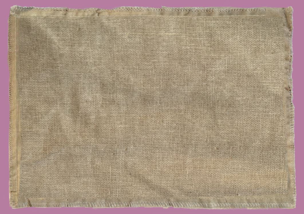
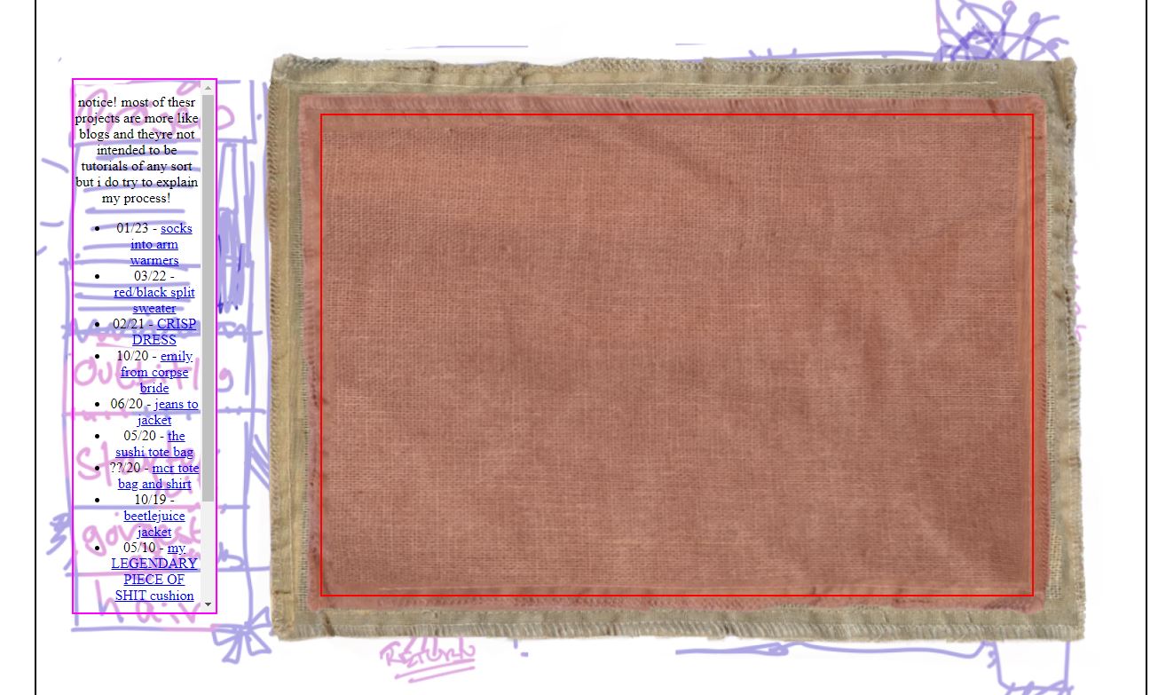
i decided to document how i made the sewing box page. at this point, id made almost all the other layouts so id settled on a style and way of working. take a look at how it used to look...
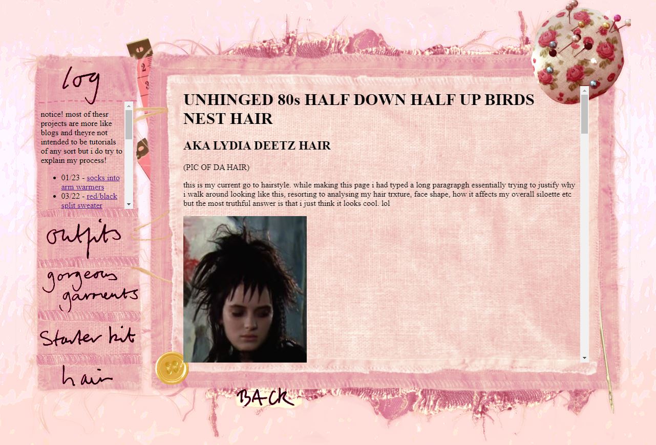
hmmm. i grew to dislike white text on white background when reading longer text, i find it is harder to read. and look, the navigation and main content boxes arent even the same height!
so first, i had drawn a sketch of how i want the layout to sort of look, and then coded a basic skeleton of the page on top of it to make sure it would work. i used borders for the div elements just for this process so i could see where things were.
then i noted down all the little features i'd drawn in and dug through my sewing things trying to photograph them. this didnt always go as intended - for instance, in digital wellbeing there were hardly any leaves to photograph in january so i went into my personal photo folders and pulled out pictures of nature from all different places and times. this time, i managed to photograph everything i wanted but i knew there was a lot of editing to be done. i was particularly worried about the fray fabrics, as this would be such a pain to try and make transparent...
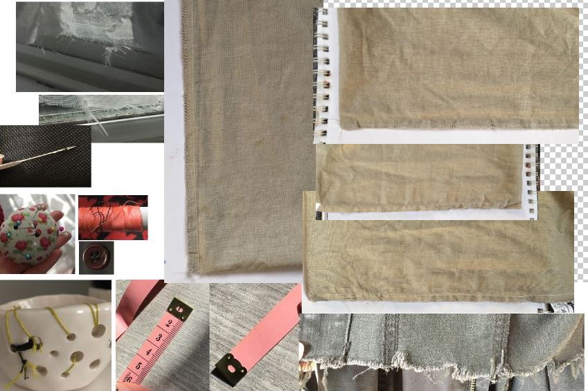
i went to work piecing everything together. this is harder to document as my process wasn't completely linear. i started with the area where the main body of content/the iframe would go. as for all the images i used in these layouts, i removed the background and transformed, erased, and sometimes painted things in until it has the correct form. as i was collaging a lot of bits together, i made the colours and overall tone uniform too for later on. throughout the whole process, i am constantly checking how the background works alongside the actual html and adjusting both accordingly.
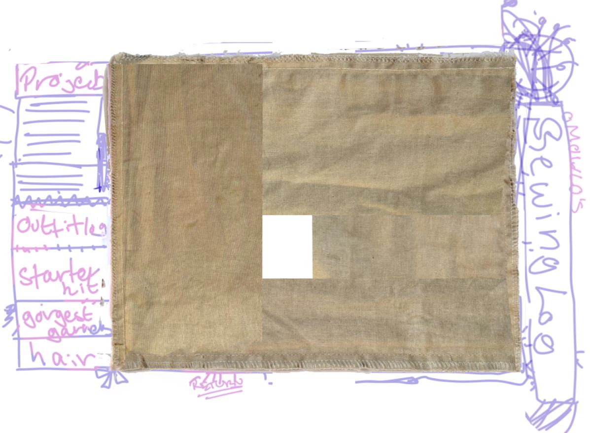
it was important to keep this area as well as the sidebar, not too busy as there would be lots of text on top of it, and i dont want it to distract from that. in the sketch, i wanted it to be somewhat layered to i flipped this image and had it a different colour beneath. i also ended up using this image for the sidebar, editing in a few more 'rows of stitching' as dividers. i also decided to omit the side bar that could say 'omoulo's sewing box', and so made the main iframe area bigger. this involved lots of stretching the image and copying bits of itself onto it. it was relatively easy to blend and i wasnt too worried about the loss of quality as again, it will be sharpened and posterised later on and put through a lot of filters.
for now, i left it at these colours so i could edit everything else in. its at this point i can see where things seem imbalanced, as its hard to gauge when simply sketching. i drew in a lot of threads and fraying, i like how it looks kind of alive...
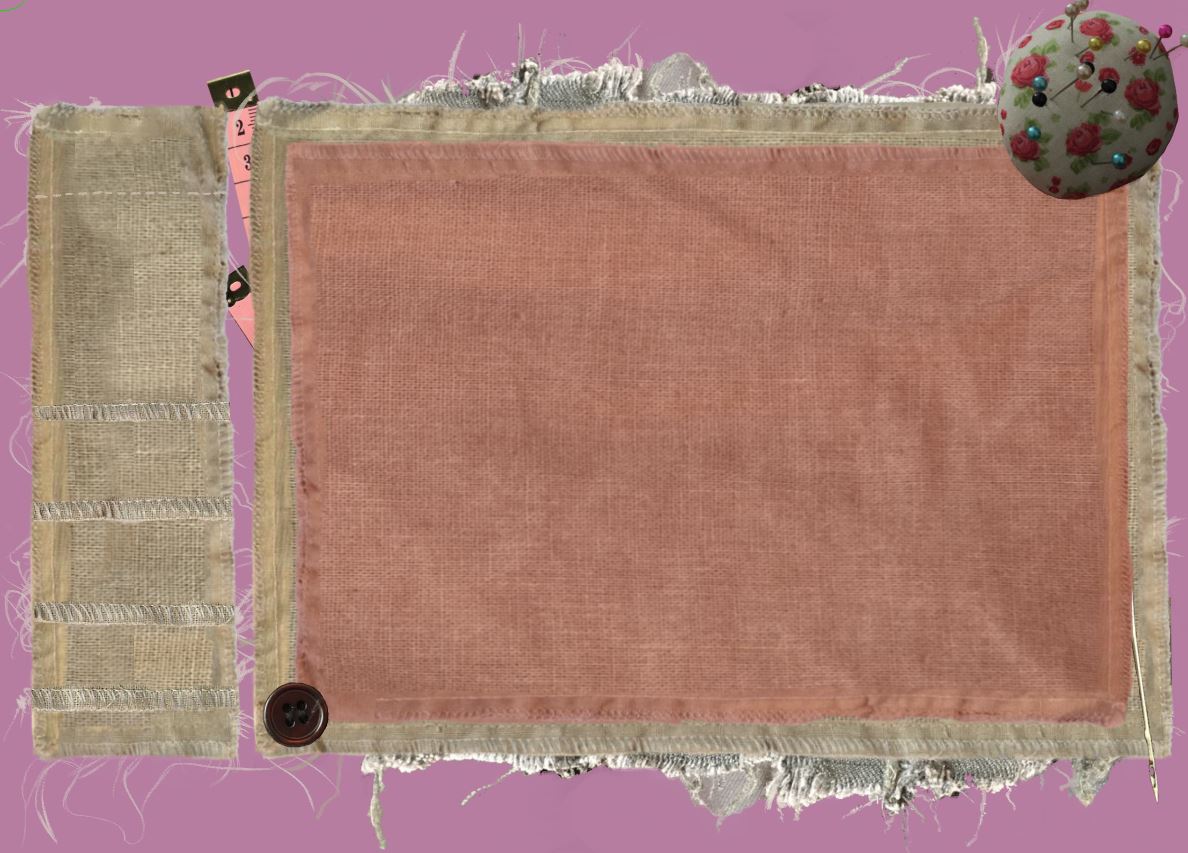
now i am quite satisfied with the layout, its time to add the text. i decided to handwrite the titles. i have the entire thing saved as a .CSP file should i decide to add/remove sections later on. i add the image and place the text where i want, then simply set the layer to 'multiply' then increase the contrast until the colour of the page disappears. the text would later become separate buttons, but for now i left them as i wasnt sure if i was going to keep that text.
i started to work on the colours. compared to other areas of the site the theme for this page was more lighthearted so i went for a pink/yellow sort of theme, pulling from the pictures of the tape measure and the pink in the pin cushion. at some point i also added various shadows to further try and marry everything together, including under the whole image so it feels less like it just got slapped onto the background.
once i felt the colours had reached a sort of conclusion, i then try and walk away from it for a bit and see how i feel when i come back. this is how i left it...
...and coming back, i was mostly satisfied but i did tweak a few things. youll see in the last screenshot after a couple days i went back and went on the more magenta end of pink instead of the redish pink. but at the time, i lightened the text just a little and shifted it over to a slightly more pinky hue. i also added shadows to more of the objects, and adjusted the brightness of the pin cushion as it looked to stark. i added a few more frays and threads too.
for the background, i kept the same image i used in the previous layout. i made it much lighter and it gave the page a rhubarb custard kind of vibe...
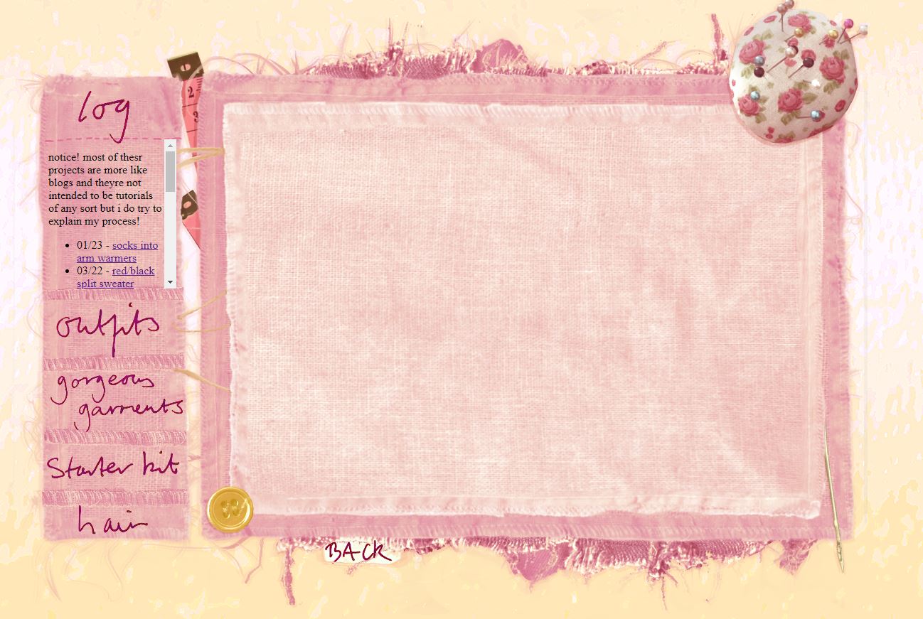
finally, it is time for the final step of the design part. to marry it to the rest of the site and also hide lots of the weirdness, and give it more of a 'digital art' feel i used the posterize tool and a sharpen after. i didnt want to overuse the tool this time as i think the background worked quite well without it.
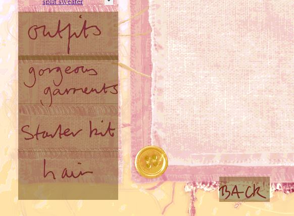
now its time to make elements of the layout into links. i made an image of a blank box that i could position over the text, and then link to the appropriate place. to visually make sure i was getting it in the right place, i made it translucent. if for some reason these images dont load, i used the alt text to ensure the page would still be somewhat useable
after this, i tweaked some other code such as linking a new css sheet to use for this page and all the pages in the iframe, which controlled how scrollbar, links, and text colours looked. i used this site to pick colours from the layout.
and that was the layout done :o) the final thing i did was save a separate version of the pin cushion that hovers on top of the pages with a z-index of 2 so that the scrollbar/other text dont float on top of it. then it was just time to refine the actual content of the page before publishing it. if you want to look at the actual code on these pages you can but tbh its still very minimal and basic hehe. shouldnt have to say it and i dunno why anyone would but please dont take these layouts and images bc as i said its all shit i made myself and ill be PISSED if someone takes the png i made of my REAL LIFE piece of PAPER
- omoulo